This evening in Breda, the Netherlands, Jose Subero, a classmate of mine from the Design Academy Eindhoven, is presenting a lecture on his innovative proposal to transform the city of Sao Paolo, by making use of its empty billboards, free from public advertising since 2007. In this article I introduce his project and discuss the different qualities art, sculpture and technology can posses when situated in public space.
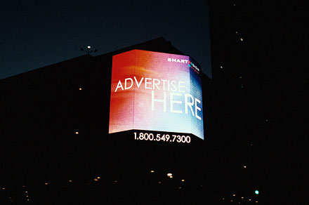
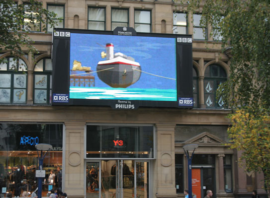
The technical development and deployment of large scale video screens – I am conflicted about using the new industry term ‘urban screens’ – has increased dramatically in the last decade. Mega cities like Tokyo and New York have lead the way, but smaller, and more conservative, cities are attempting to catch up. Organisations exist to promote their deployment and the generation of content for them. Supposedly not always advertising…
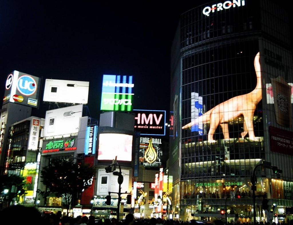
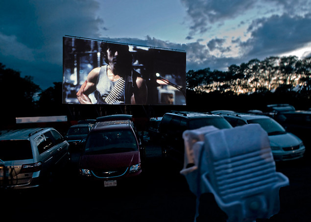
I am not a fan. Its not that I don’t enjoy watching these large screens sometimes. When I was very young, I stood in awe outside a drive-in movie screen in Melbourne, perhaps the last of its kind in that city, while they screened First Blood, the first Rambo movie. The screen was so large it was easily visible from outside the fence. I was astounded. Likewise, the enormous advertising screens you see in Shibuya are superficially amazing. Once, when I was living in Tokyo, I saw the same walking Brachiosaurus that amazed Scarlett Johansson’s character in Lost in Translation. Yet, I don’t have to live or work in Shibuya with any frequency, which I believe makes a difference to the impact of these advertising screens.
There are alternatives however; technological developments in projection have recently enabled large scale projections onto buildings and other urban structures:
In this last example, the projector is hidden and the spectacle temporary. Afterwards there is nothing left, but empty space and whatever the architect or city planner intended. The problem with large screens is that they need physical and vertical space, a permanent billboard, on which to work. These either block sunlight or vista, if free standing, or architectural facades if adhered to the sides of buildings. Not so enjoyable for the windowless tenants inside. Think of them like a price tag on an artwork…. (This is just rhetorical – unfortunately I can’t actually imagine all architecture has the same status as art.)
In the digital age a video screen is a blank canvas capable of displaying anything, including public and interactive art. New technologies even permit semi-transparent screens. Should this mean a tolerance for such structures? Or the kind of sanctity reserved for public artwork such as statues or sculpture?
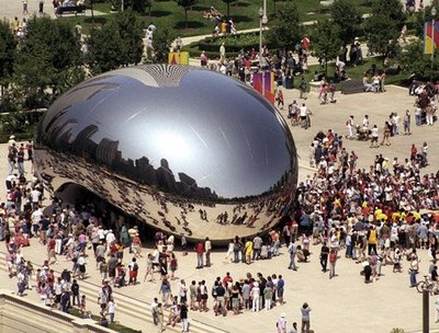
Their are certain differences that structures like statues and public skulpture have compared to technological objects like animated projections or screens with moving images. One is that they are static, they don’t change over time and so vanish from our perception when we do not have the time or inclination to perceive them. Consider this optical illusion as an analogy.
The human mind seems biologically wired to ignore static visual information, and perhaps this is essential in the urban environment. Personally, I have a wandering mind and have a hard enough time paying attention to life threatening traffic when walking around the city. It won’t get better for me; this article gives an indication how, at the current rate of deployment, urban video screens will dominate our lives within the next few years. I suppose as human animals we have a remarkable ability to adjust to environmental changes, but…..
Another difference is the temporal quality of the structure. Statues and sculpture tend to last for a long time, so permanence and timelessness, is part of the feeling they provoke, which I think in the case of public art is a good thing. TV screens and other technology devices with a visible and physical body don’t have this timeless quality, because the rapid changes in their internal technology produce aesthetic changes in their form. They are perceived as period objects. Even my use of the phrase TV screen feels outdated. What modifier should be placed in front of ‘screen’ to make us understand what it actually is? Video-screen-, movie-screen , digital-screen,… these phrases have or will become outdated, just as the forms they make us think about are outdated. This is a fundamental problem with technology.
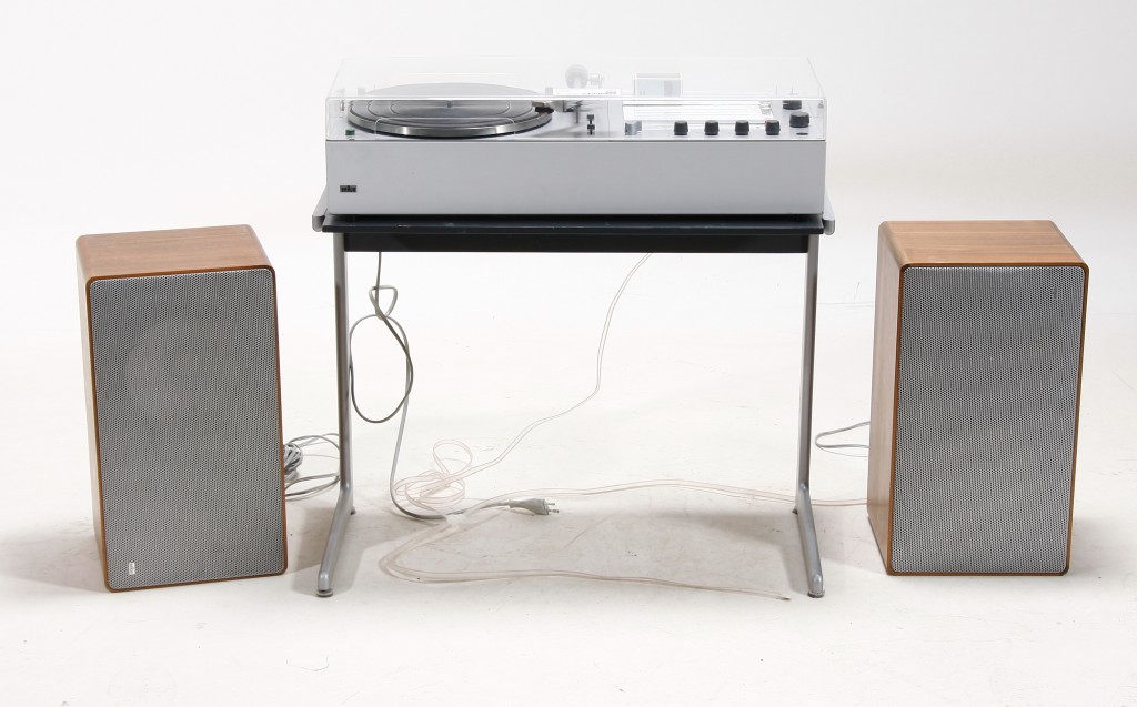
My grandfather, the architect Nevile Gruzman, commented on this problem to me once, when discussing a car sales room he had designed in the 1950’s. It was photographed by Max Dupain in 19955, and decades later my grandfather reflected that while the building in the photographs still looked reasonably contemporary, the cars, as technological objects, had dated far more. The chaining of an object to the period in which it was created is directly related to the amount of technoogy it contains. In fact it is the cause, along with fashion trends and the desire for change in general, of the period style itself. So of course its pronounced with product design; just look at any old home electronic device and you can pick the decade in which it was produced with ease. The very best industrial designers, Dieter Rams, Bang &Olufsen, even Ettore Sottsass, worked to resolve this problem, but their work is still dependant on the underlying material, technology, which, over time, is a slippery and polymorphous sculptural material. Marble it is not.
Large outdoor video screens can be compared to the traditional family television (before we all had our personal devices in our rooms and pockets) in that they can bring people together for a time based event. You see this with drive-ins and at big rock concerts. This is an attraction to urban designers and advertisers, because they imagine a public crowd slack jawed en masse in amazement. But the analogy is false because it only works for temporary spectacles. When a permanently installed video screen is run continually, and they always are because to turn them off makes no aesthetic or economic sense, they soon become banal. In Shibuya and Times Square the locals ignore them and really its only the technologically star struck tourists that stand around slack jawed. Ubiquity begets banality.
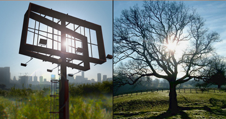
A more exciting 21st century concept is to get rid of them all together, billboards and advertising signage included. This is exactly what the Brazilian city of Sao Paolo has done. In 2006 they passed a law requiring all advertising to be removed from the city’s billboards. They are left vacant and empty, but also transparent; structures through which light can penetrate. I have heard stories about residents in the densely packed city awaking to find fantastic views from their apartment, right to the horizon, through billboards previously covered with cigarette advertisements.
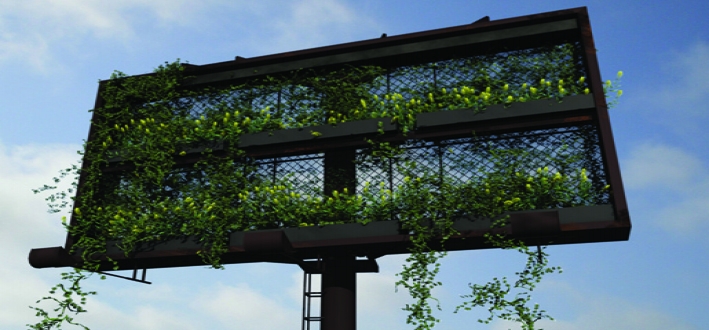
Something still needs to be done with these industrial skeletons. One proposal is from a former classmate of mine from the Design Academy Eindhoven’s Humanitarian Design program. José Subero has proposed an exciting concept to use them as ‘greenboards’; places to grow plants and vegetation. Their location inside the city makes them perfect for food gardens, or even threatened species that require tending and care. The concept images and video illustrate the transformation this proposal could have on the city. A partial proof of concept has already been made in collaboration with Sao Paolo architects Bijari on a small vacated billboard opposite the Fundação cultural de Curitiba, though as Subero notes in his blog Naturezas Urbana, this deployment is different to what he proposes for the large industrial steel structure which he imagines would have have the most impact. The benefits of this idea when applied on a large scale are, I hope, obvious, but Subero iterates some of them: improved oxygen emissions (in a smog filled city), improved bio-diversity of plants but also animal bio-diversity, tourism and socio-cultural benefits plus potentially carbon credits.
My position is that in a world with larger and larger cities and less access to farms and forests, we should be integrating nature into the urban environment as much as possible. More parks, city farms, (public and private), rooftop gardens and something growing everywhere. Trust me, I’m not a hippie or a luddite; these changes will have aesthetic, social and economic benefits. Technological infiltration must be minimal, and technology itself practically invisible. This is happening slowly already thanks to miniaturisation. The development of intra-personal device technologies such as augmented reality will mean that the real world and virtual information can be meshed discretely and viewed privately or shared at the users will. For the creation of large scale shared spectacles there is projection on the sides of buildings and urban structures. I sometimes think that people, especially designers, love video screens so much because they saw them in sci-fi movies like Blade Runner when they were children. As visionary as science-fiction movies can be, do they serve as reliable guides for the non-fictional future?
Jose Subero speaks tonight the 20th May 2010 at the Graphic Design Festival Breda, in the Netherlands, details here.
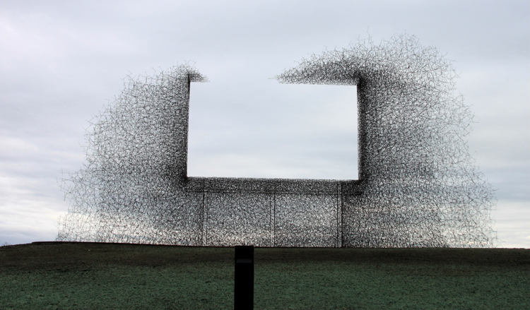
UPDATE: The idea to do away with the content of billboards, but make new use of their structure, might be spreading. Recently I found out about this swingset concept from Mésarchitecture. Below that, is a new sculpture from Lead Pencil Studio on the border between the States and Canada, which proposes to advertise “nothing but clean air”. I think its an interesting sculpture, but find its use of the billboard negative space convoluted. Unlike Jose Subero’s and Mesarchitecture’s concepts, they are re-creating the silhouette of a form that purportedly want to remove? It seem’s counterintuitive. On the other hand, its aesthetic, mimicry of a self-assembling parasitic organism, suggests a post-apocalyptic interpretation; the sculpture has surrounded, enclosed and outlasted an old billboard used as scaffolding.
List of Images in order from the top down:
- Naturezas Urbana (Jose Subero)
- Urbanscreens.org
- Flickr user: enuwy (Creative Commons Attribution-NonCommercial-NoDerivs 2.0 Generic)
- A doctored image of Rambo on a drive-in screen
- projection on Gorey Castle by Evan Grant / Seeper for the Branchage Festival 2009
- Cloud Gate by Anish Kapoor
- Two images of Purnel Motors, Sydney, designed by Neville Gruzman, photographed by Max Dupain in 1955
- Gillete Supermax Pro 1300 uploaded by Flickr user: Faasdant. Probably not designed by Dieter Rams, but by Morison S. Cousins, although Rams worked for Gillette’s parent company the influence is clear.
- HiFi that is designed by Dieter Rams
- urbanscreens.org
- Naturezas Urbana (Jose Subero)
- video from Naturezas Urbana (Jose Subero)
- Mesarchitecture’s Double Happiness
- Lead Pencil Studio, photo by Ian Gill
Note that some of these images kind of express the opposite of the point I am making. Makes it interesting that way.
