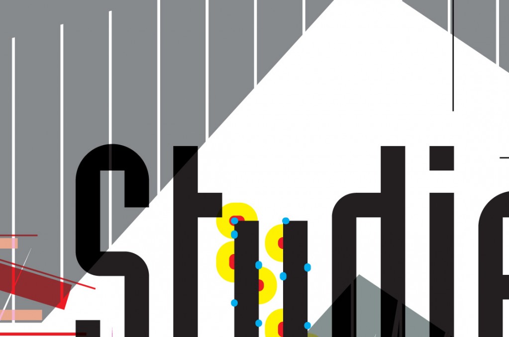
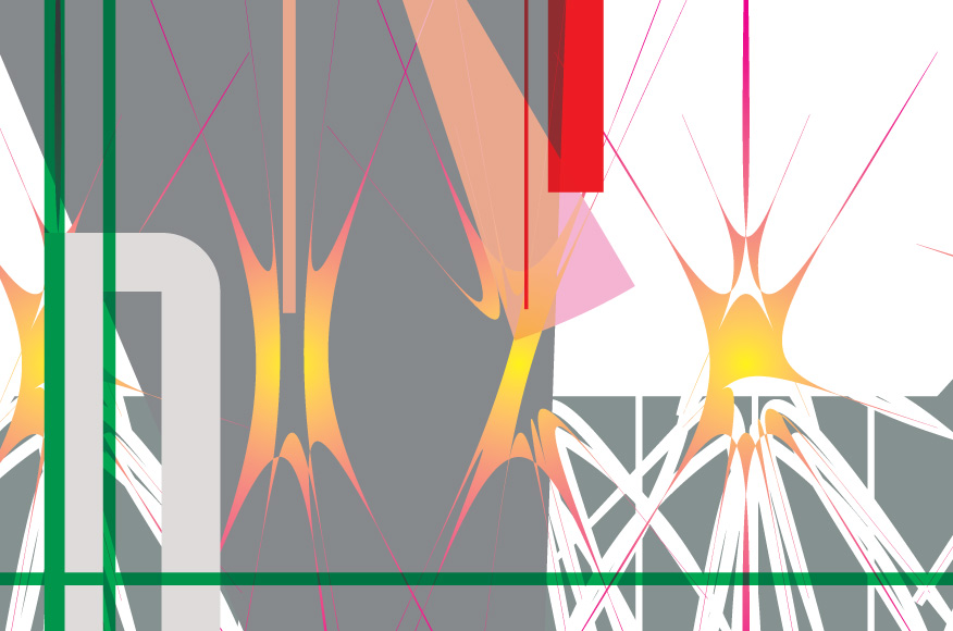
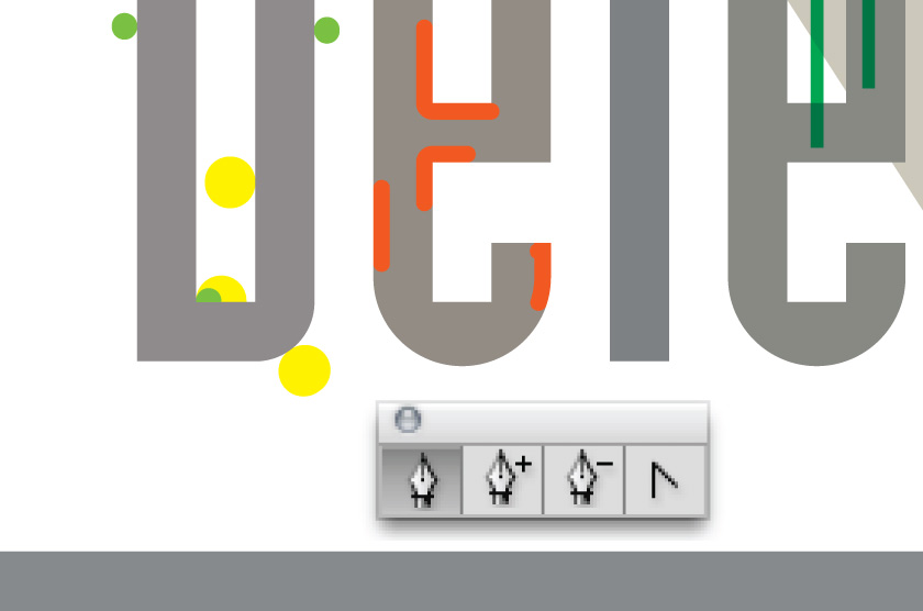
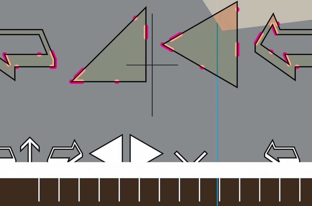
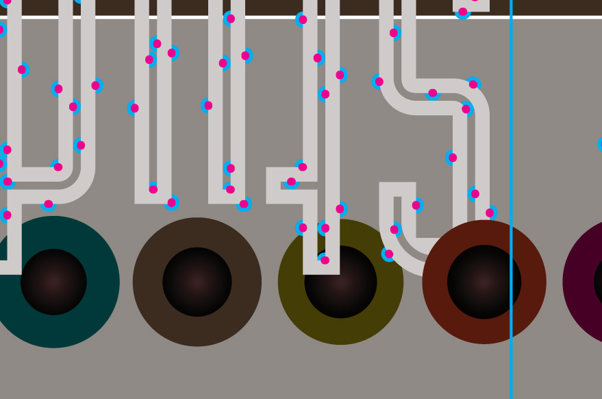
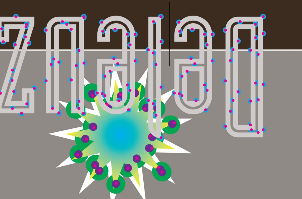
Cover for the Deleuze Studies Journal
Last year I was invited by Andrea Eckersley, the art editor of the Deleuze Studies Journal to contribute a cover. Conventionally, this means sending an image that is slotted into a pre-designed template that makes Deleuze Studies Journal covers look consistent. In Deleuze-speak, this could be called a stratified or striated design system. But Deleuzians are often interested in those forces, whether social, political, or creative, that can break down or destabilise stratified systems. So I thought it interesting to consider how I could mess with the existing template system, short of actually redesigning it. This cover plays with the processes of copying, repetition, transformation and distortion possible within print-ready output from vector-based graphic design software. I attempted to include elements that had the potential to be aesthetically challenging, such graphic distortions, a missing glyph character and a typo. More significantly, I included technically challenging details for the printer, such as hairlines, inconsistent overprinting, non-expanded vector graphic effects and, probably the worst, over-saturated CMYK inks for rich greys and blacks. These latter effects are prone to smudging on the press or even flooding the paper with ink to the point it warps. I noticed a few of these features subtly changed during the proofing phases, probably due the vagaries of pre-press software and probably unnoticed by the printer. In conventional print design projects such changes can bother clients and infuriate designers. But in the end, the printer did a very good job managing my intentionally ‘bad’ design – and that suggests they may have also intentionally tweaked some of my ‘mistakes’ in the pre-press phase. The final printed cover looks good.
