Ivana Taylor: Wrapped with care, for Garland Magazine
My submission to the Right to Repair Public Inquiry

Essay: New Materials, Fast Tech and Slow Design for Hybrid
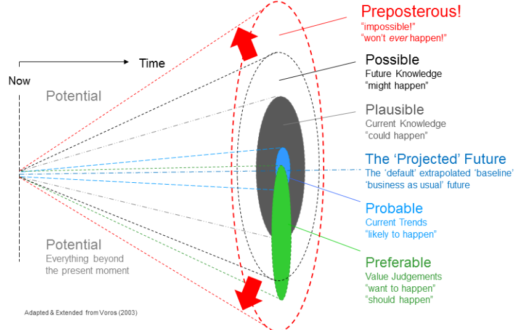
Time to start thinking about the world you don’t want.
The Case for Wood, article for Garland Magazine
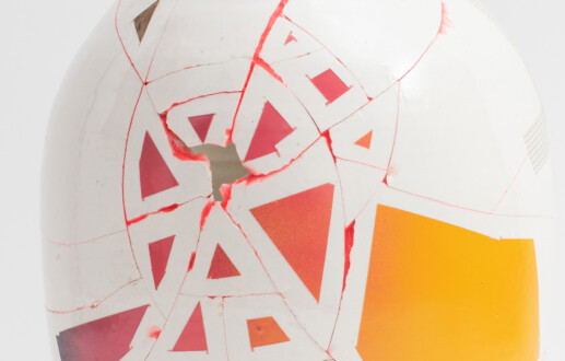
Transformative design: finding value in the damaged and the broken
Life & Death, in Garland Magazine
Notes on the idea of a Wasteland
Grant success: ARC Linkage Designing for sustainability using a transformative repair model
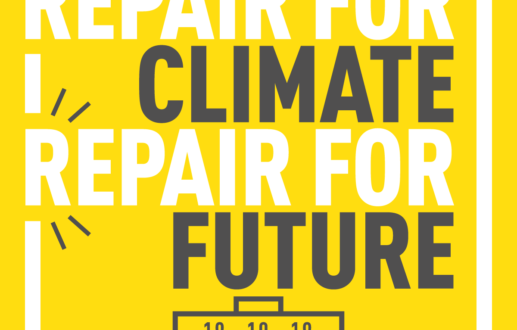
International Repair Day 2019 news
Anyoji, transformative reuse